These days, we have to be amateur detectives to understand the truth behind products and whether they are good for us. Recently my mom told me she found an amazing bread company at a farmers market. I asked a few simple questions: Was it gluten free? (Both she and my dad are meant to avoid it.) Was it organic? What kind of oil was in it? What other ingredients? Was it wrapped in brown paper with a handmade-looking label and tied with rustic twine? My mom, laughing, said, “It was! It looked so nice.” Food packaging tricks fooled her!
After listening to me for 12 years, my mum rarely gets fooled by the label anymore – but the packaging did! And she is not alone. We are all fooled by packaging these days.
As you know, I encourage all of us to take an active role in deciding what to buy by improving our BS detectors and educating ourselves before we make purchases. Unfortunately, as we get smarter, so do the companies trying to grab our moolah and belly space. evolving food packaging tricks to convince us that their products are healthy and worth the higher price.
I’m also not immune to being fooled by the label, and I consider myself a sharp and savvy shopper. I’ve written extensively about the label claims companies use to lure us in, like “gluten-free,” “vegan,” or “100% natural,” and we devoted an entire episode of the Today Is The Day podcast to it, too. But beyond words there are even more tricks – visuals – that play with our emotions and try to influence our purchasing decisions.
When I was studying fashion marketing, I took a course on packaging design. I was fascinated by the process. Today, with the emergence of one of the weirdest social video trends I’ve ever seen, the unboxing, the stakes are even higher when it comes to packaging.
For the sake of this post, I’m putting my distaste for wasteful unnecessary packaging that creates junk into a little box that we’ll revisit in an upcoming post next month. Today we are dealing with appearance.
The Food Packaging Trickery Test
Before you read any further, take a look at the four bottles of sesame oil below. Get out a piece of paper or use your phone and play along!
Based on the packaging alone, choose the following and mark your answers:
- The best quality;
- The most economical (cheap)?
- Which would you be inclined to buy?
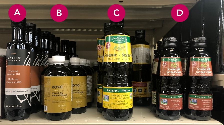
The answers are revealed below.
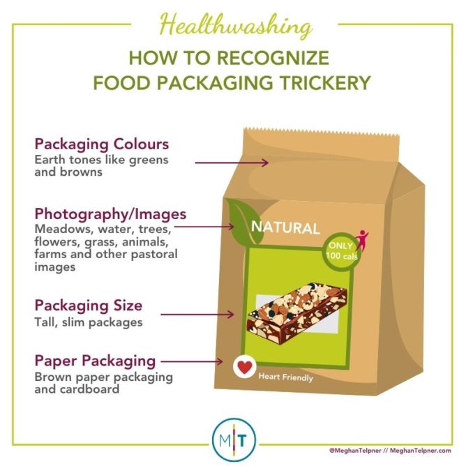
How to recognize food packaging tricks
Packaging Colors
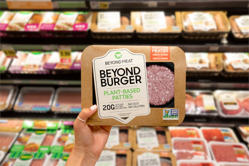
Companies use “color psychology” to evoke an emotional response and persuade us to buy their products. The colors marketers choose for their packaging have a big impact on our perception of the product’s health benefits. For example, earth tones like greens and browns they are more likely to convince us that a product it is healthy, eco-friendly, wholesome and natural. Beyond Meat, for example, used every trick in the book packaging its processed pea protein patties.
Get this, we even think green-labeled candies are healthier than red ones (this is a link to an actual study that tests this!), even when the nutrition label information and calorie counts are exactly the same!
Color saturation also plays a role. We consider soft, muted colors healthier than bright and vibrant ones. Subdued colors look more natural, unlike bright colors that make us think of artificial colors and artificial flavors.
Do you want to take a test? Okay, which of these granola bars do you think is the healthiest option?
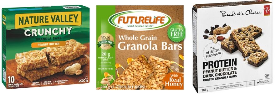
What did you guess? How sure are you?
The answer is none of these. It’s all junk, but something about the packaging on the one you chose spoke to you and made you think it was the healthier option.
Photography/Images
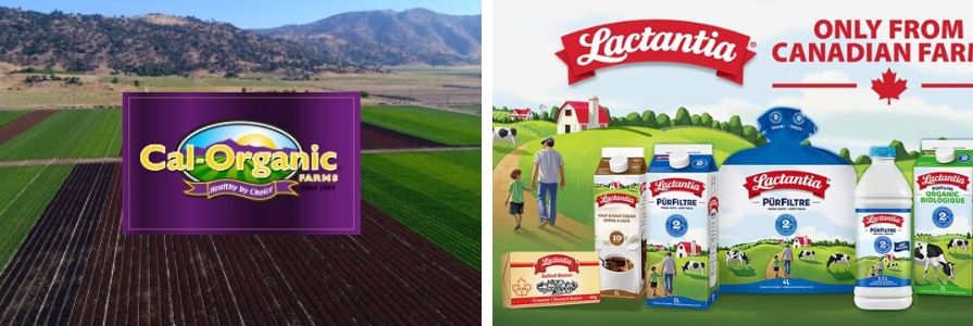
Beautiful meadows, water, trees, flowers, grass, animals, farms and other pastoral images try to convince us that food comes straight from the source, with minimal processing or adulteration. In most cases, the actual mechanisms that transform food from farm to package are anything but natural. Often these foods never came from a farm in the first place and were made in a lab.
In the case of Cal-Organics, one of the largest organic food distributors in North America, the food comes from hundreds of farms in the US and has become part of the big food that has caused global food recalls. I wrote more about it here.
Package size
We understand food that comes in tall, thin packages as healthier and lower in calories than short and wide packs – even if the amount of food in those packs is exactly the same.
Tall, thin food packaging can often give the perception of being fancier, and may also carry a price tag that could support this misconception. The best thing to do when comparing two products is to forget about the package size and just look at the volume measurement on the bottle. Olive oil is a prime example of this. 750ml may look different depending on the bottle. Check the size, ingredient and actual certifications to help you decide which is the best option.
Paper packing
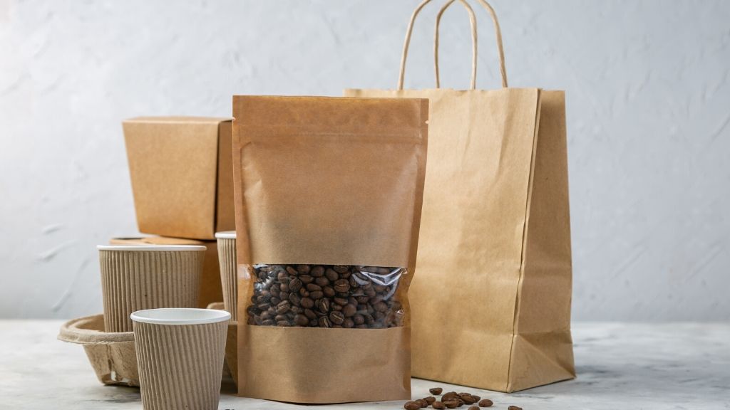
The brown paper packaging and cardboard has a rustic look and feel, which makes us believe that the product is better for us. In a poll, Americans said they preferred paper or cardboard packaging because it seemed safer and more reliable from a food safety point of view, plus they liked that the paper was recyclable. While I’m all for ditching plastic for better alternatives, paper doesn’t automatically equate to a healthy product!
Your best defense against being fooled by the label is to read the ingredients on the package. The ingredients list will tell you everything you need to know. Not all products that use the food packaging tricks I mentioned are bad for your health, but you won’t know until you actually read the ingredients label – that should always be your first stop!
The Packaging Test: Truth Revealed
After reading the above, would your answer to the three questions about sesame oil change?
I took the price and divided it by the milliliter in the bottle to get the cost per milliliter.
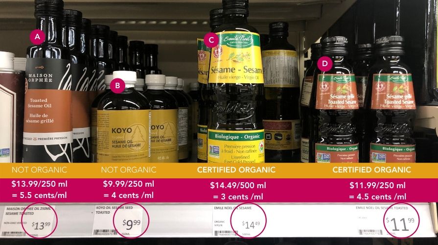
For my values of always choosing organic and not falling victim to the packaging, option C is the clear winner. Based on the packaging alone, this would probably be my last choice.
What I also liked about this random test, random because I had no idea what the result would be when I took this photo while shopping last weekend, was that the package I thought was the ugliest was also organic and the most affordable selection.
Doesn’t this flip the packaging trick and our preconceived notions about organic food being more expensive, just the other way around?
How did you do? (Post in the comments!)
More Healthwashing Tips and Label Sleuthing
The secret to reading nutrition labels
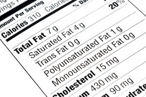
What to look for when reading nutrition labels.
READ MORE
Healthwashing: 8 tricks you need to know
Learn the tricks I use to detect healthy washing.
READ MORE
How to stop being fooled by the label
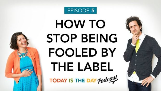
Our podcast episode breaks down what all those nutrition labels and health claims really mean so you’re never fooled by a label again.
LISTEN NOW
What is natural flavor?
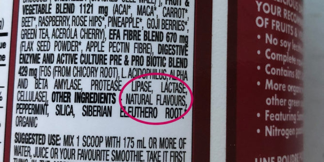
Find out if natural flavors are really natural.
READ MORE
What does naturally increased mean? Deciphering meat labels
What meat labels mean and questions to ask your meat producers.
READ MORE
Free resource library
Enjoy over 40 downloadable guides, recipes and resources.